| | Desktop Publishing : Page Layout |
|
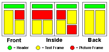
A page in a desktop published document is set out as a group of frames which are positioned onto the page by the user. Here is an example page layout for the front page of a newsletter :

This layout includes two text frames which will contain the article that is to appear on this page. There is one picture frame which will contain a photograph to illustrate the article. The top frame will contain a header which will appear on every page in the newsletter. A frame can usually contain either text or a picture (but not both). A frame can be positioned and resized independently of all of the other frames.
This diagram shows the layout of all of the pages in the newsletter :

Although the exact layout of each page is not the same, the designers of the newsletter have adopted a consistent design for each page, i.e. :
The page designers will also have chosen consistent font styles so that text on each page has a standard appearance.
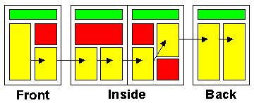
Often an article on a page will not fit into one text frame. An article may have to be split between two or more text frames which may or may not be on the same page. So that this can happen desktop publishing packages will let you link frames together. You can link any number of frames together in any order to form a chain. When one text frame is filled up the text in the frame will automatically flow into the next text frame in the chain.
This diagram shows how the newsletter frames will be linked together :

The facilities to draw frames anywhere on a page and link them together in any order make a desktop publisher a far more powerful package for setting out documents than a word processor.
GCSE ICT Companion 04 - (C) P Meakin 2004